Visual systems that communicate, not just decorate.
High-fidelity screens built from agreed wireframes — design decisions made for reasons, not aesthetics alone.
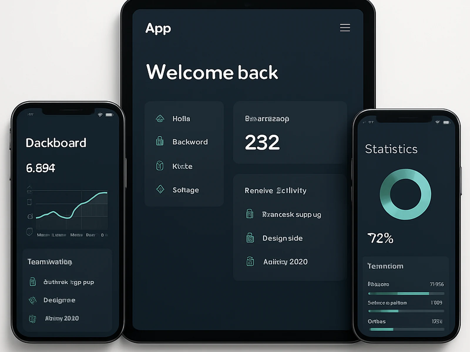
UI Visual Design is where the product becomes visible. At Nova Studio, this phase begins from approved wireframes — the structural decisions are already made, and the visual design phase is about executing them at a level of quality that earns trust from users and makes developers' work precise.
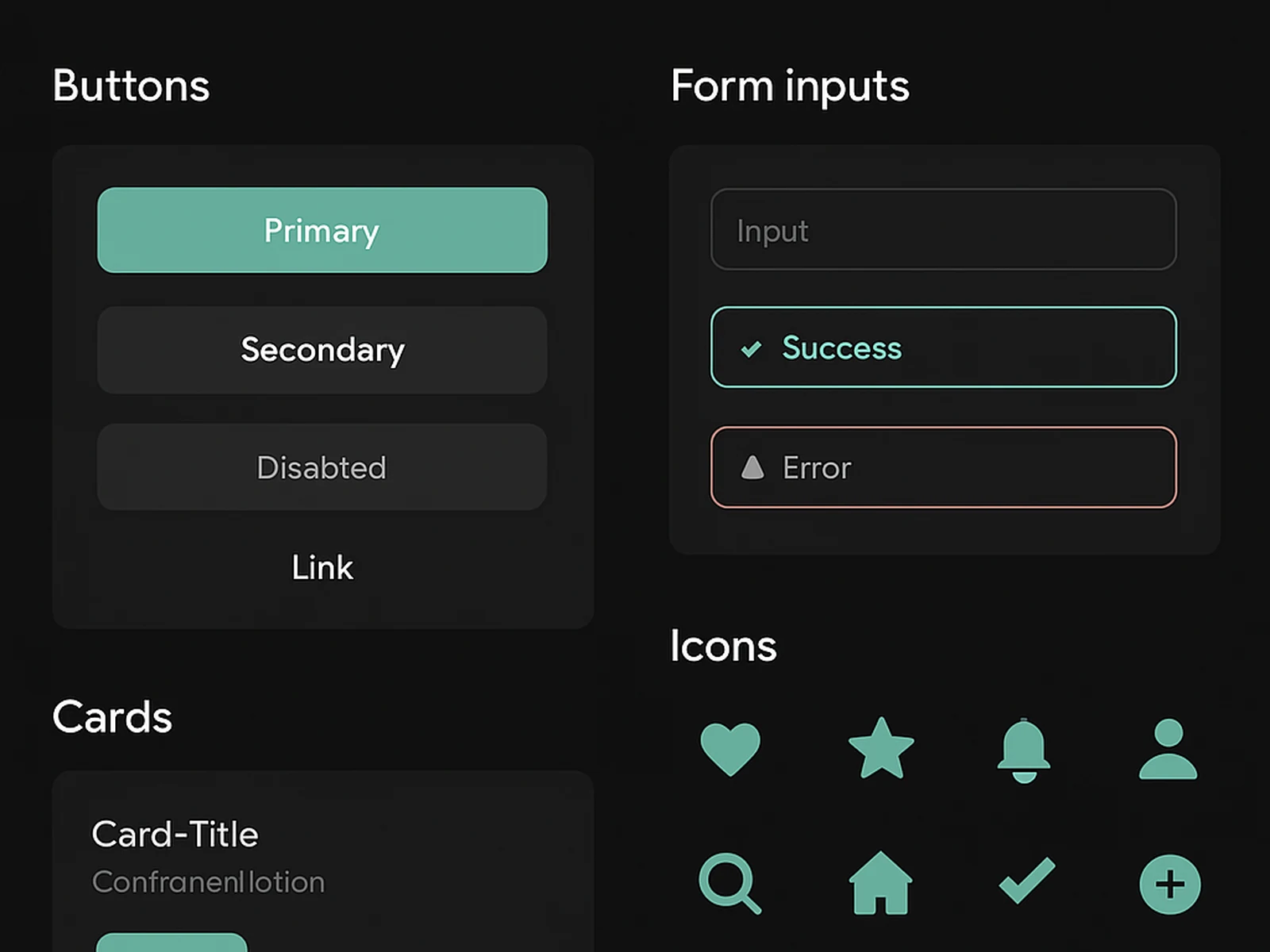
We design component-by-component. Before full-page compositions are produced, the core component library is established: colour tokens, typography scales, spacing systems, interactive states, and the foundational UI elements that every page will use. This ensures consistency across the full product without individual screens having to re-solve the same problems.
For SaaS products and web apps, we always design for both light and dark modes from the start. Retrofitting dark mode to a design system is significantly more expensive than building it in from the beginning.
Accessibility is a design constraint from the first component, not a checklist at the end. Colour contrast, touch target sizing, focus states, and keyboard navigation patterns are addressed in the design, so they do not need to be fixed in development.
Delivery is in Figma with full design specifications: every component annotated, every spacing value explicit, every interactive state designed. Developers should never have to guess or measure.
In practice
Common questions
This service is included in our Standard and Studio packages, and available as a focused sprint.
Start with
UI Visual Design.
Choose a package or build your own. We reply within one business day.